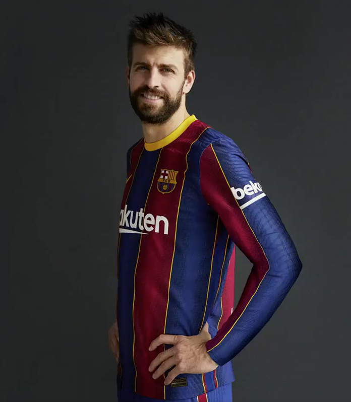
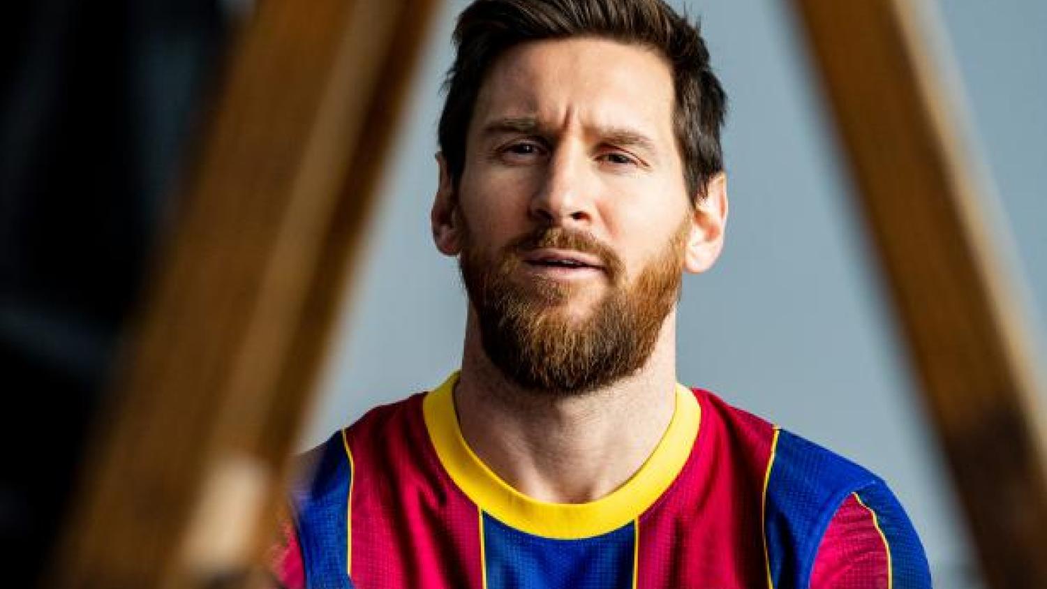
Given the club’s unique blaugrana colors, Barcelona has sported some of the most iconic jerseys in world football. The release of the home Barcelona kit 2020-21 on Tuesday was an attempt to tap into some of those legendary shirts. An attempt.
Barcelona’s blue and maroon vertical stripes are one of those special sights in football that represent sporting history and excellence, dating back to the club’s first match in 1899. Last year’s shirt featured a new checkerboard design that was a departure from tradition but following Croatia’s success at the 2018 World Cup a fun and memorable one.
For the 2020-21 season, Barcelona is attempting to return to its roots. In particular, the Barcelona kit 2020-21 was inspired by the club’s first golden era of the 1920s, when its vertical stripes first began to look like a modern blaugrana jersey. It’s a classic look made famous by some of the biggest legends of the game, from Johan Cruyff to Diego Maradona.
It was a pretty straightforward task: Get back to the basics and rake in the money from the fans who buy a new jersey every year.
But the Barcelona kit 2020-21 fell short of that “iconic” level. The new jersey falls somewhere between middling failure and huge mess.
Barcelona Kit 2020-21 (Home)
Our new first kit 20/21 #OnlyForCulers pic.twitter.com/HtuojoRxsg
— FC Barcelona (@FCBarcelona) July 14, 2020
— FC Barcelona (@FCBarcelona) July 14, 2020
Photo session 2020/21 pic.twitter.com/n1h9JkyXoO
— FC Barcelona (@FCBarcelona) July 14, 2020
I really hope this new Barcelona kit grows on me, but at the moment I just can’t wrap my head around it.
The gold collar is nothing new, but this year feels particularly intrusive. The gold trim between each blaugrana stripe is weirdly distracting. And maybe it’s because these are just some early kits shipped for a photoshoot, but none of the Nike shirts appear to fit all that well. The long-sleeve version manages to look baggy on the body and way too slim on the arms.

Barcelona Kit 2020-21. Photo: @FCBarcelona | Twitter
Here’s what the club wrote about the new kit:
This season, the jersey is recovering its traditional vertical stripes, but is including gold as a distinctive element. The ‘blaugrana’ stripes are bordered on each side by gold strips, which evoke the design of the Club crest that the team wore on their shirts throughout the 1920s. Another outstanding feature of the new design is the roundneck collar that also has a gold-coloured rim, while the Catalan ‘senyera’ flag appears on the back, just underneath. The full kit also includes blue shorts, with a vertical maroon stripe on the side, which also has a gold rim, and horizontally striped socks that imitate the shirt design. Once again, this season’s jersey is going on sale with the logo of Rakuten on the front and Beko on the left sleeve, Main partners of the Men’s team, and the logo of Stanley, Main partner of the women’s team.
The jerseys look slightly better on the women’s team, but that’s no surprise really because the women’s team actually won the league this season, something the men’s team is unlikely to do this season.
+ @AsisatOshoala
Aconsegueix la samarreta de la temporada 20/21
https://t.co/VG6GhiA2GS pic.twitter.com/rV1lTeBR2a— FC Barcelona Femení () (@FCBfemeni) July 14, 2020
On the bright side, the Barcelona 2020-21 kit was designed with sustainability in mind. The shirt and shorts are made with 100 percent polyester from recycled plastic bottles using “vaporknit” technology to keep things breathable and light.


