The biggest news of the Major League Soccer offseason so far has been the Chicago Fire’s new logo. For many, it was a bigger shock to the system than seeing Giovani dos Santos score goals for Club América.
Named for the greatest story our city can tell - its own legend.
— Chicago Fire FC (@ChicagoFire) November 21, 2019
Chicago isn’t the first to take on a new visual identity that’s modernized (cleaner, simpler and more of a brand as opposed to a traditional football crest). In recent times the likes of Juventus, Atlético Madrid and West Ham have made similar changes, albeit to varying extremes.
Having said that, amendments and total overhauls to badges are applicable to almost every club around the world — especially those that trace their origin back over 100 years. Because of that fact, some great (or at least interesting) crests have been abandoned to the fog of fading memory.
Here are 25 historical badges that I’m pretty fond of for whatever reason.
25 Old School Badges That I'd Like To Put On A Hat
1. Newcastle United | 1983-1988
'Cause I'm a punk rocker, yes I am.
2. AC Milan | 1980-1982
I invented electricity. Ben Franklin is the Devil!
3. Sporting Kansas City | 1996
Mine eyes have seen the glory.
4. Ajax | 1928
Bring back the helmet detailing!
5. AS Roma | 1977
The Capitoline Wolf in all of its glory.
6. Sevilla | 1918-1921
For me, this is just the right amount of squiggly.
7. Atletico Madrid | 1942
Top Gun vibes.
8. Leicester City | 1983-1992

Crazy like a fox.
9. West Ham | 1975-1980
I miss the old West Ham, the beat-your-ass-at-the-Boleyn-Ground West Ham.
10. Manchester City | 1976-1981
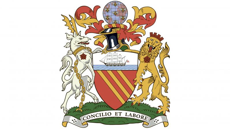
Maybe the best coat of arms I've ever seen.
11. Arsenal | 1994-1996
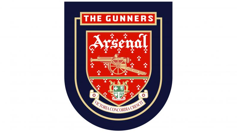
Boom boom boom boom / I'm gonna shoot you right down.
12. Celtic | 1988
The badge for Celtic's centenary.
13. River Plate | 1985-1986
Classic cat-in-paper-bag behavior.
14. Sporting de Gijón | 1950
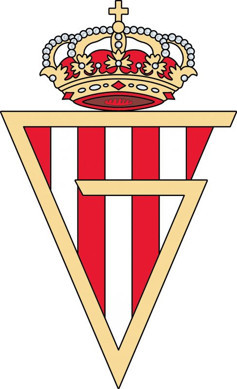
The sort of "G" you used to draw all day in middle school.
15. Borussia Dortmund | 1976-1978
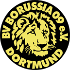
RAWR
16. Eintracht Frankfurt | 1977-1998

Looks like a great beer hall.
17. Lille OSC | 1981-1989

One for the good boys.
18. FC Nantes | 1968-1973
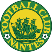
Looks like the Flying Dutchman.
19. Olympique Marseille | 1972-1986

This would make for a sweet ball cap.
20. Club America | 1938-1946

Las Aguilas
21. Atalanta | 1963
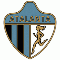
Where's she going?
22. Minnesota United | 1976-1981

Back in the NASL days.
23. Derby County | 1946

Looks like a Digimon.
24. Swansea City | 1980s
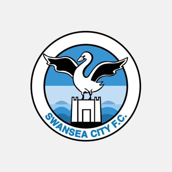
The kind of swan that comes after you in the park for no damn reason.
25. Fulham | 1931
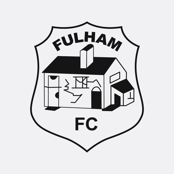
It's the neighborhood traphouse.


