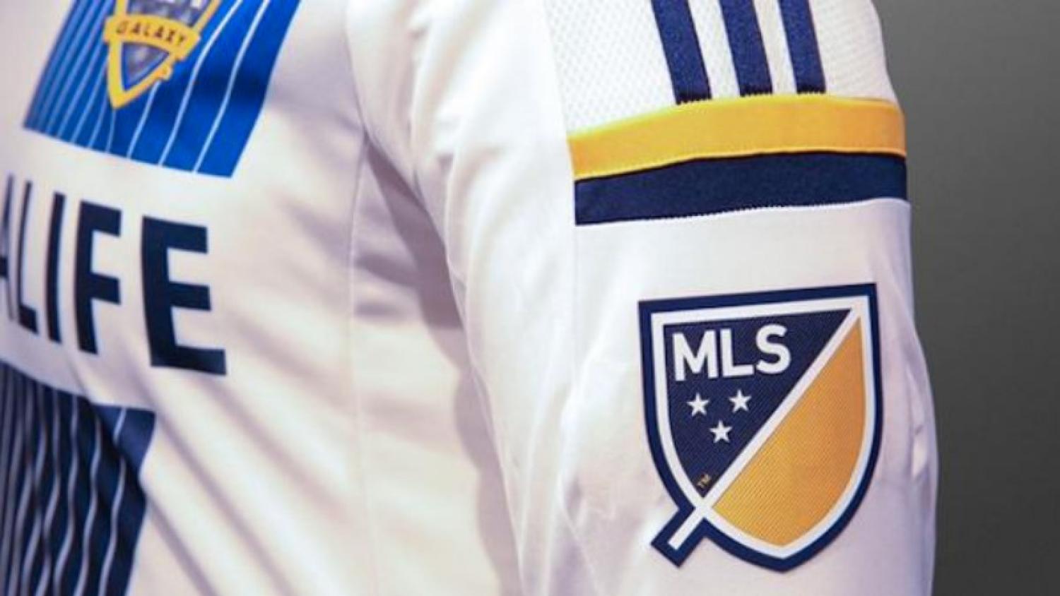
With soccer on the rise in the United States, MLS is taking advantage. In what is a complete rebranding effort, MLS is saying goodbye to the "boot and ball" logo that has served the league since 1996. This is actually the 6th logo in the league's history, but this logo is a completely different theme than the last five.
MLS chief marketing officer Howard Handler said the old logo is a thing of the past and that the new one is “aspirational.”
The logo is simple and clean. The crest shape is divided into two halves by a 45-degree line. According to MLS, the slash refers to “soccer’s speed and energy.” They go on to say that it illustrates the nonstop nature of the game and the rising trajectory of the league. It creates a “first half” and a “second half.”
The three stars represent the pillars of the brand- “For Club, For Country, For Community.”
Before the U.S and Belize played in the 2013 CONCACAF Gold Cup in Portland, the Timbers Army and American Outlaws had massive banners that featured those exact words. “For a number of us it was a gigantic epiphany,” Hanlder said. “It hit us square between the eyes. This was the very best of what the league can deliver.”

The giant banner that inspired MLS's new logo. (Photo: @thegoalkeeper | Twitter)
In addition to getting their driving idea from fans, it is a good move by the league (in The18's opinion). It’s a new era for soccer in the United States and MLS is taking advantage.
Entering its 20th season, the league has legitimate players, a new TV deal worth about $90 million annually, and new clubs in New York, Orlando and Atlanta. Additonally, Minneapolis, Las Vegas, San Antonio and Sacramento are all also bidding for teams. It’s blowing up to say the least.
Each team will don the new logo on its jersey sleeve, but it will be in the club's colors. It’s another part of the rebranding effort that focuses more on club identity rather than league identity.

Each team will have the MLS logo in their clubs colors. (Photo:@TotalMLS | Twitter)
“We’re sending a very strong message that the club marks are the most important. The clubs are really the primary connecting point for our fans. They wear their colors. They declare their loyalty and we want to be able to amplify that and build on that with the way that we frame the league mark,” Handler said.
Well done MLS. The old 90s clip art logo served you well for the past 20 years, but it is time to embrace the new passion for soccer in our country with a new look. MLS is doing all the right things to get the league on the same level as the big four (NFL, NBA, MLB, NHL) and, with the increased amounts of money being thrown into the effort, the results will speak for themselves.


